Graphic Survey
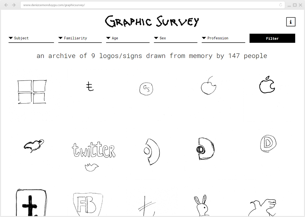
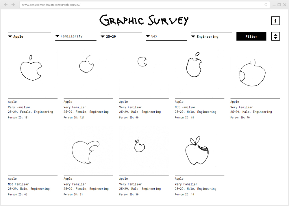
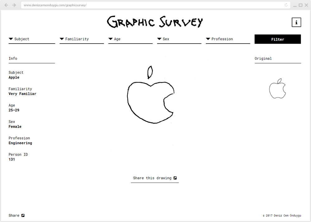
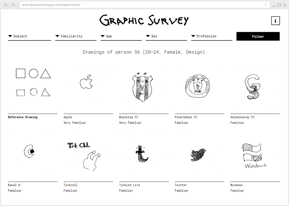
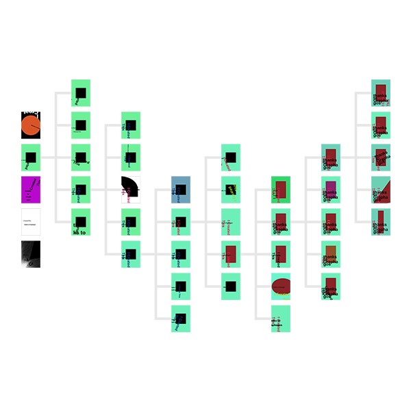
This is an archive of drawings of 9 logos/signs by 150 people (and counting). These people drew these logos/signs as they remember them, without looking at an instance. On its website you can filter and sort the archive by the age/sex/profession of the participants, by their familiarity with the subjects and by the 9 different logos/signs.
Go to project website
Go to project website
Graphic Survey is a personal research project about questions such as: Which structures/parts/details are perceived and remembered by more people? Which graphical plays are not understood on a semantic level? What left-right mistakes do people tend to do in asymmetrical structures? Is there anything special about the logos which people don’t remember at all and leave blank? And are there any demographic patterns in the answers to all of these questions?
I had a hunch that this archive could generate some insights about the visual/graphic/semantic capabilities of both the logos (for being correctly perceived and remembered) and the people (in general, and subgroups of them like “25–29 years old people in design”) but my main motivation for this project still is the fact that the drawings are just so fun to flick through.


