
New Force-Directed Graph with Philosophers as Nodes
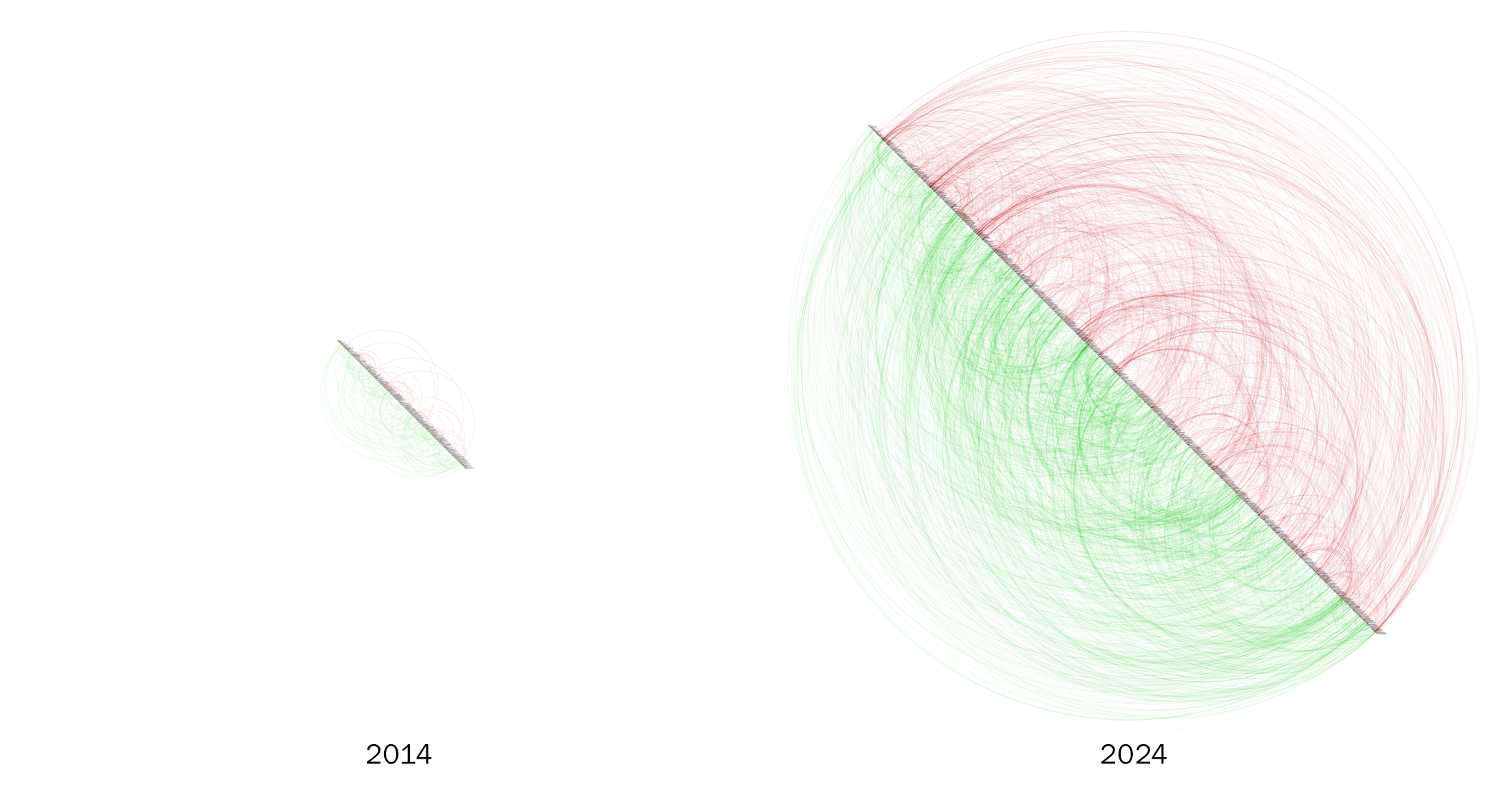
It’s been over 10 years since I started working on this research and visualization project which has become my main occupation outside work. Both its content and its interface have been developing with continuous upgrades over the years.
Although I’m more than happy with its current state in terms of information visualization and I’ll continue to work on expanding its content, I’ve also been wondering what other visualization methods could be used with this database I’ve been carefully developing based on my readings. Specifically, I’ve been wanting for a long time to work on an auxiliary visualization, a force-directed graph with philosophers (instead of sentences) as nodes. Finally I’ve had the opportunity to do it, using the amazing Kumu platform.
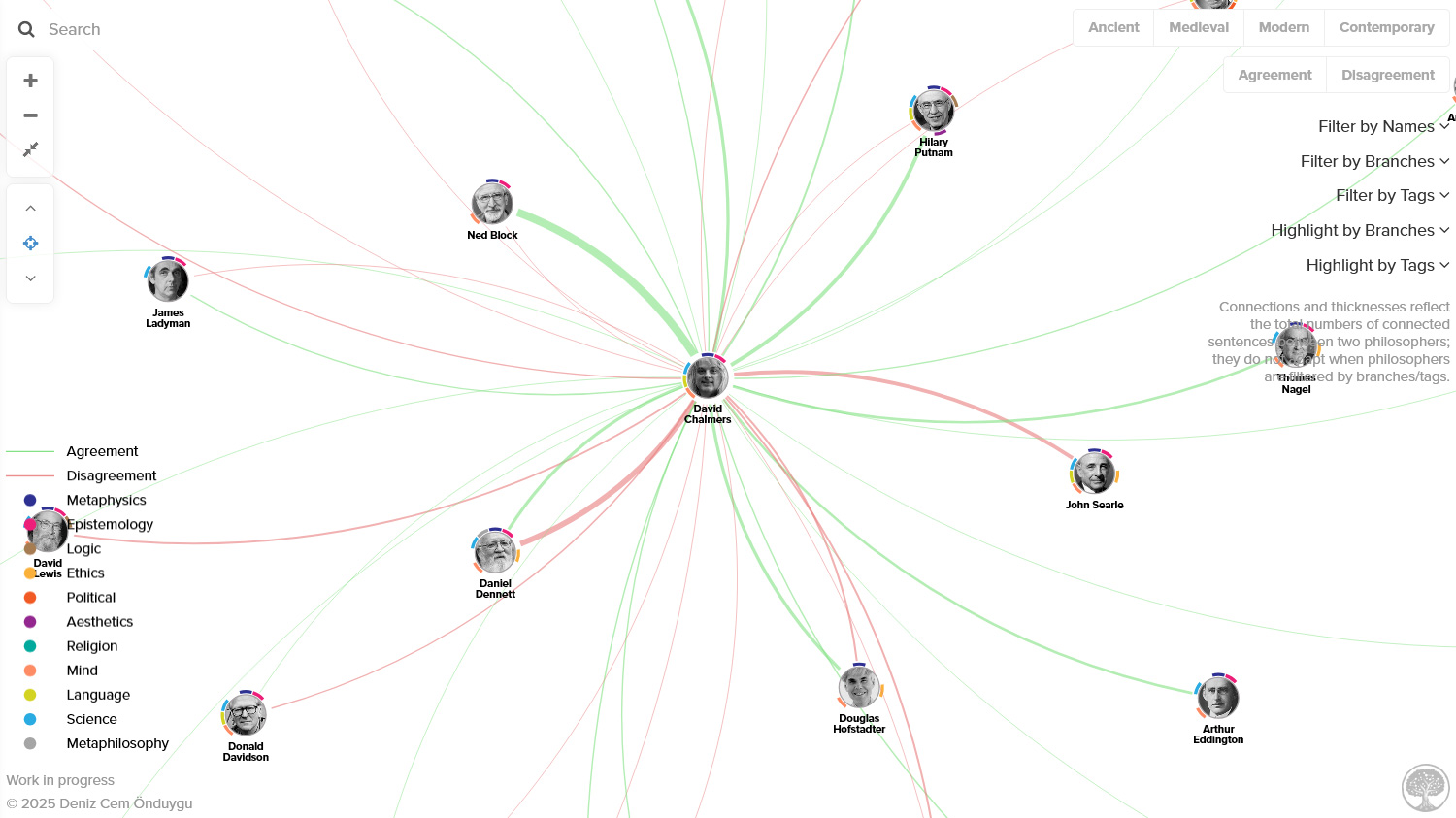
After some sketches and demos, I designed a new database and restructured my data with the help of my computer scientist friends Eser Aygün and Amaç Herdağdelen who always save the day whenever I need help with programming. (Eser had also programmed the first static version of this project back in 2014.) For each philosopher, we calculated the total numbers of agreement and disagreement connections with other philosophers, a list of the branches (metaphysics, epistemology, etc.) of their sentences, and a list of the tags (names of arguments, theories, -isms, etc.) of their sentences. After the database transformation, I went on to work on the visualization, interface, and filterings, and finally published it here. Here’s how the final thing looks:
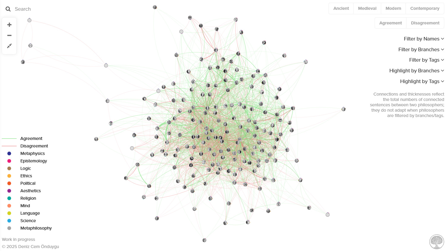
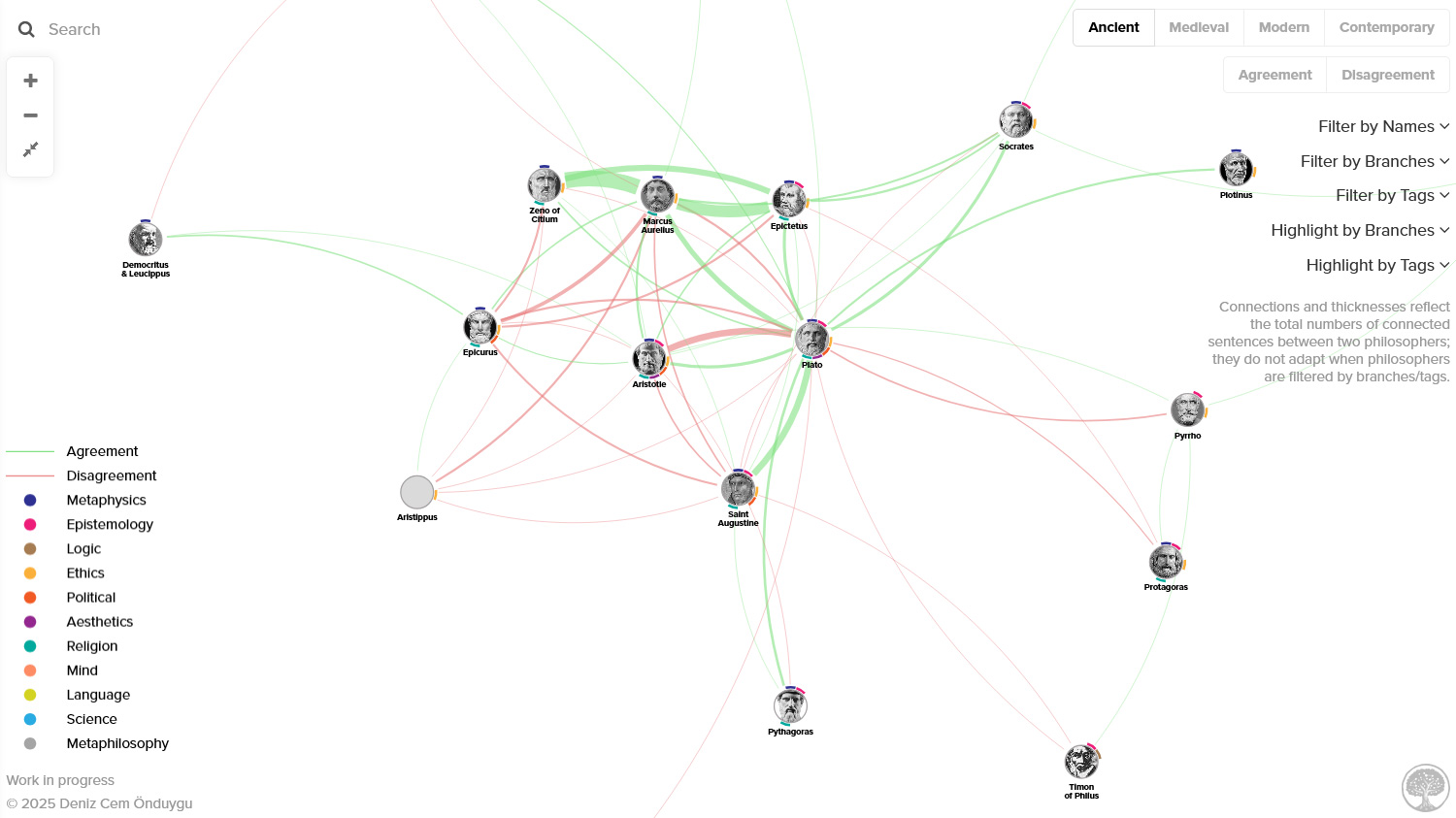
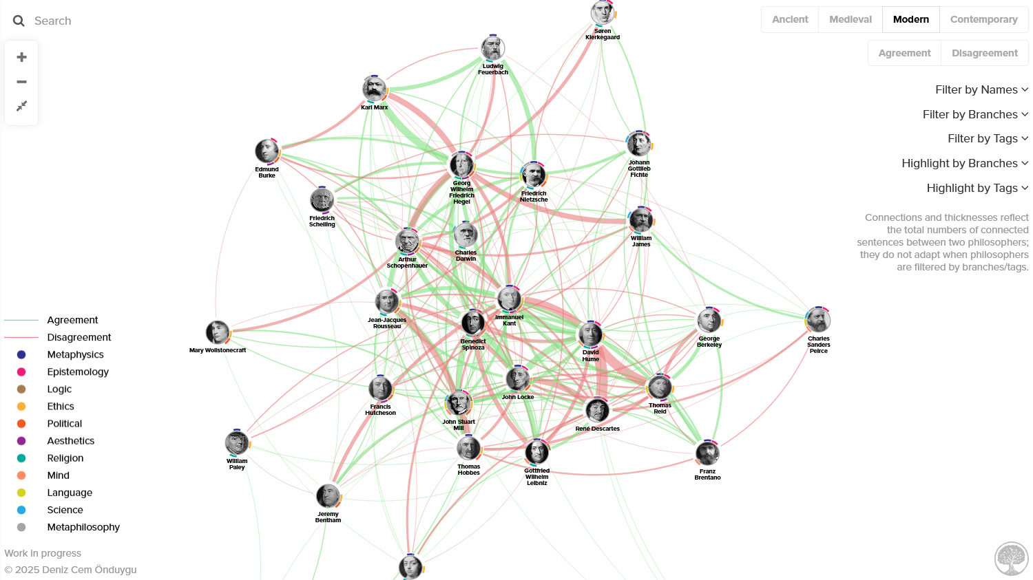
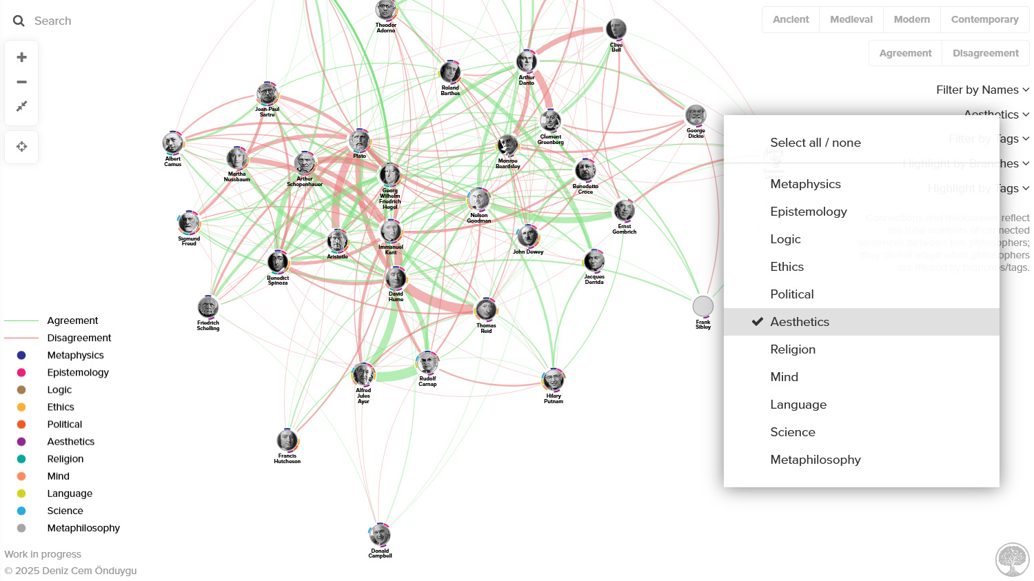
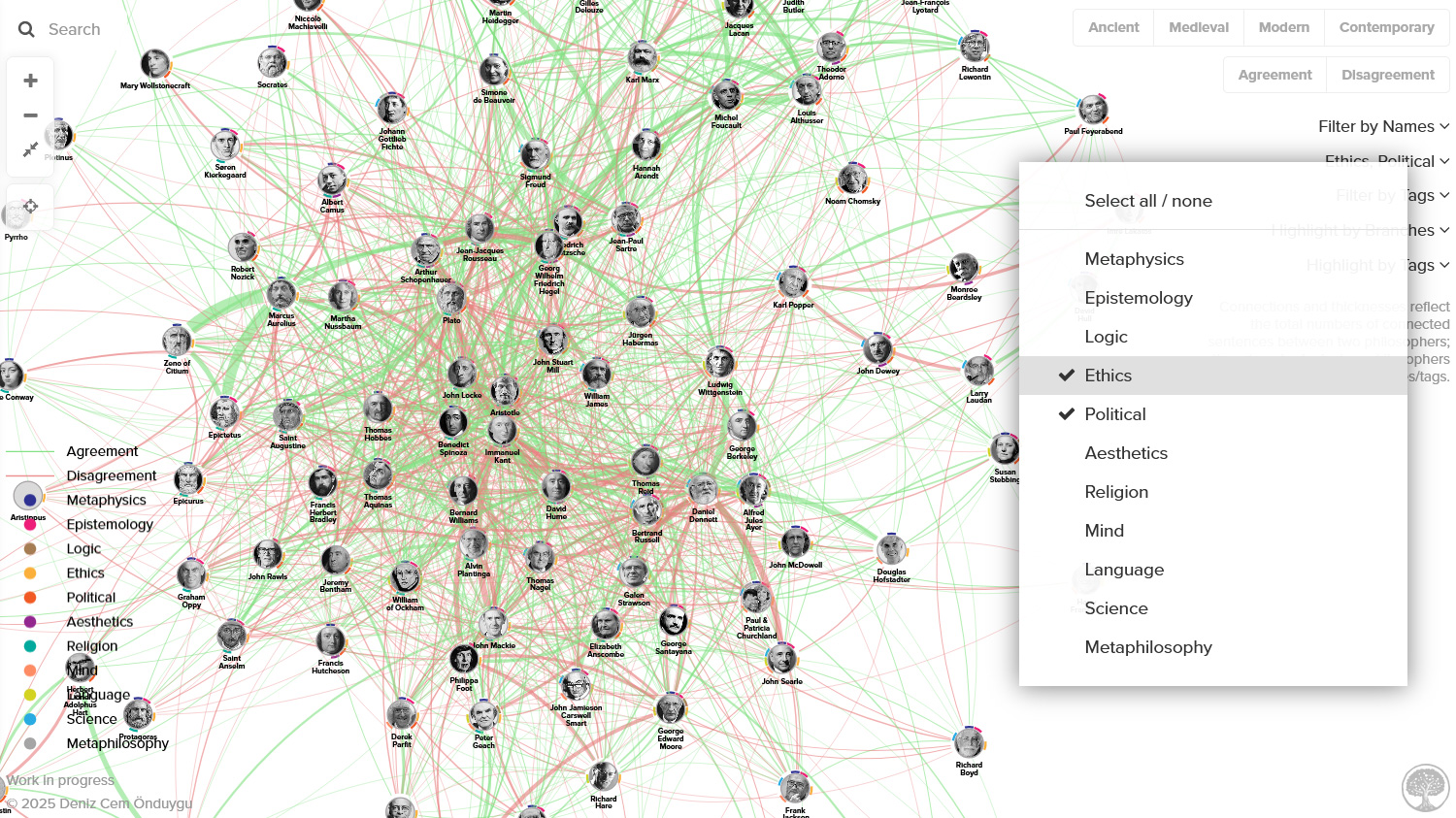
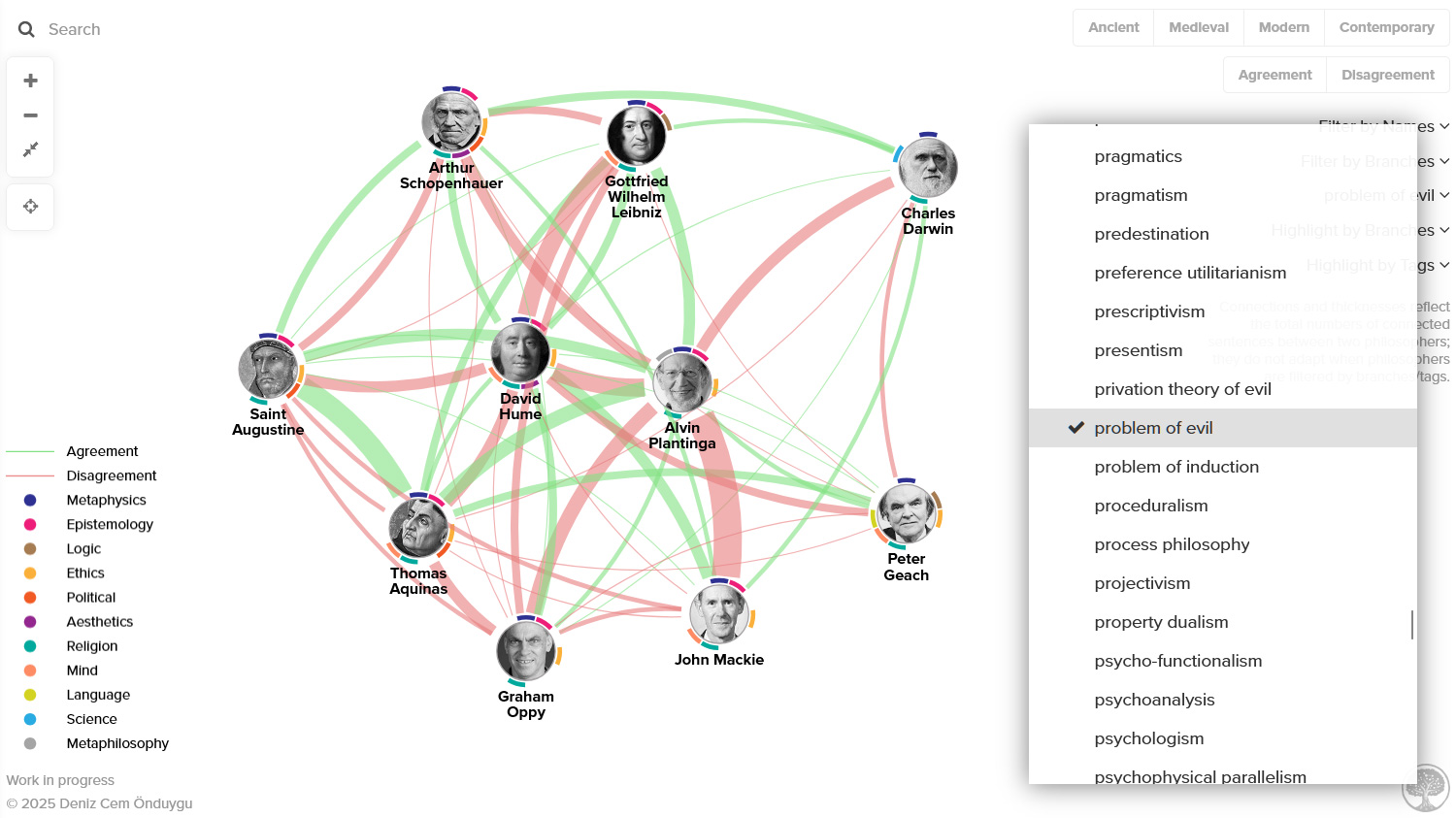
For those who are not familiar with force-directed graphs: I have not directly positioned the philosophers where they are – the positions are dynamically calculated by an algorithm using the connections (edges) between philosophers (nodes), “by assigning forces among the set of edges and the set of nodes, based on their relative positions, and then using these forces either to simulate the motion of the edges and nodes or to minimize their energy” (Wikipedia). (For this reason, each reload may result in small changes in the relative positions and major changes in the overall rotation of the graph. You can drag nodes and check how flexible their positions are.) That said, I’ve spent some time adjusting the parameters of the algorithm for an optimal result for this specific content and visualization. So it’s good to see how reasonable clusterings automatically arise with this force-directed layout, thanks to the connection data I’ve curated and the adjustments; philosophers of mind are close to each other in a region, Continental philosophers are close to each other in another, etc.
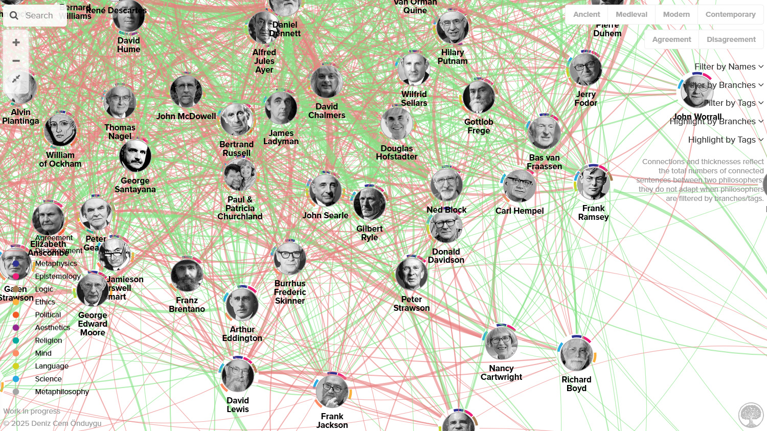
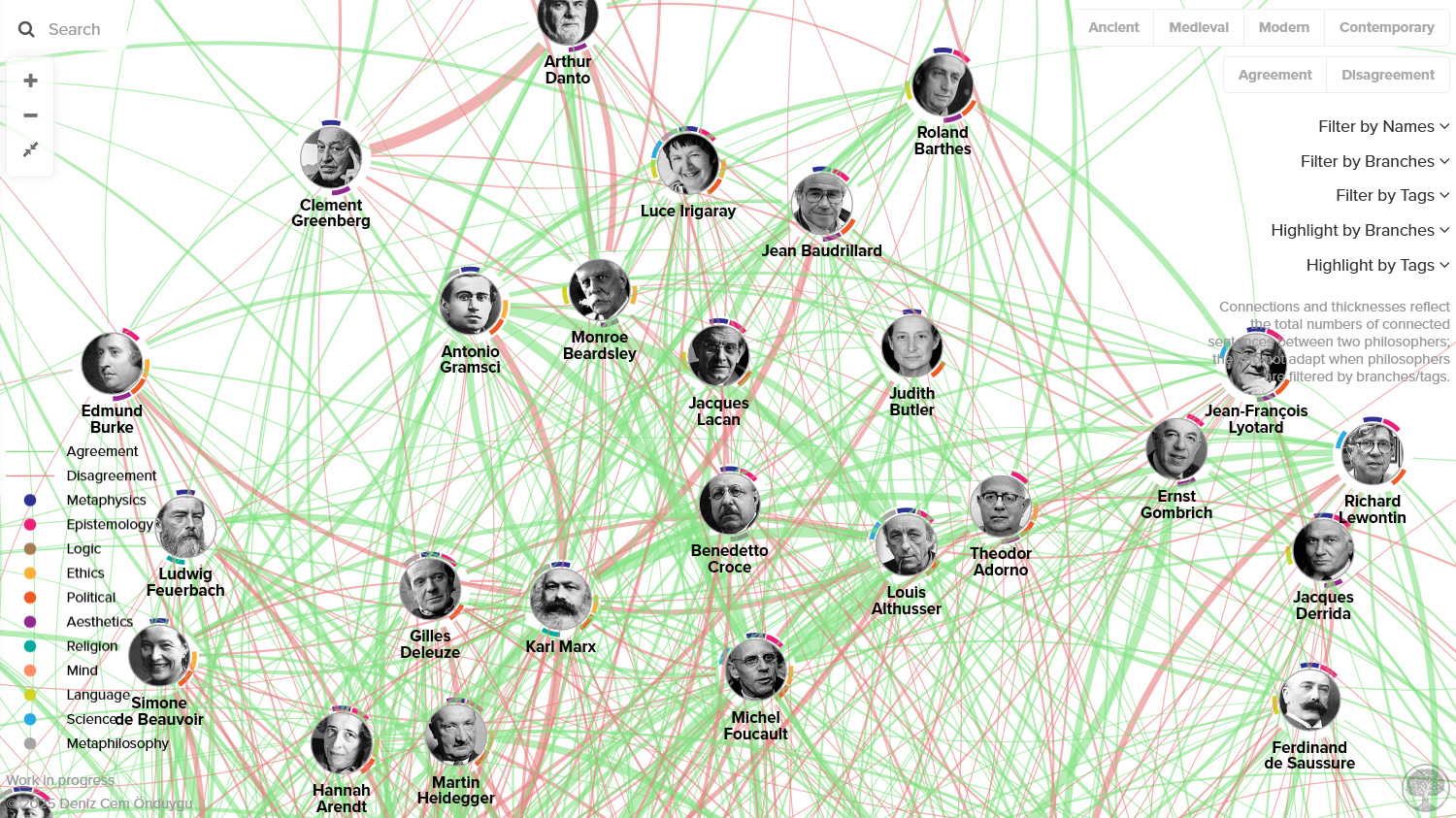
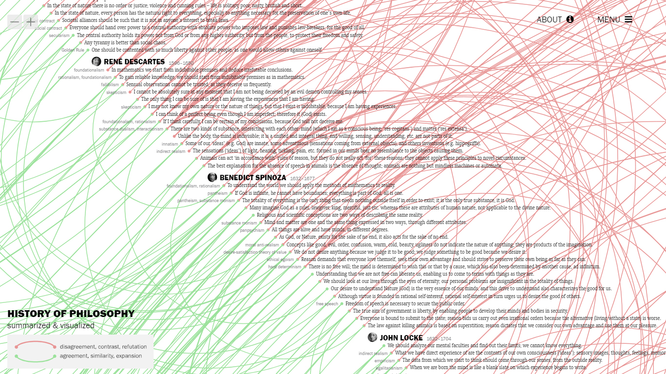
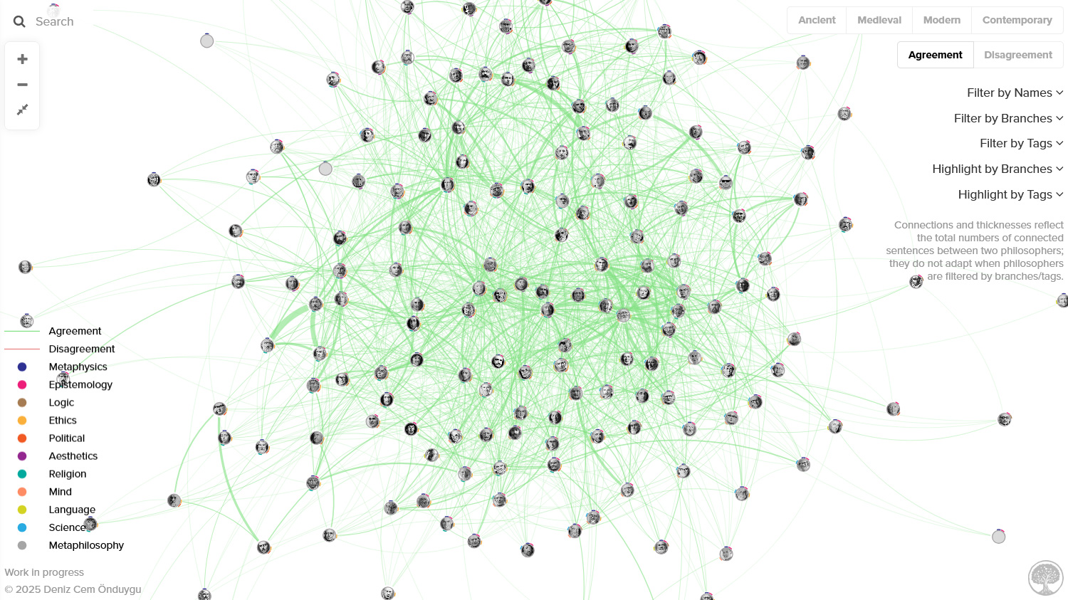
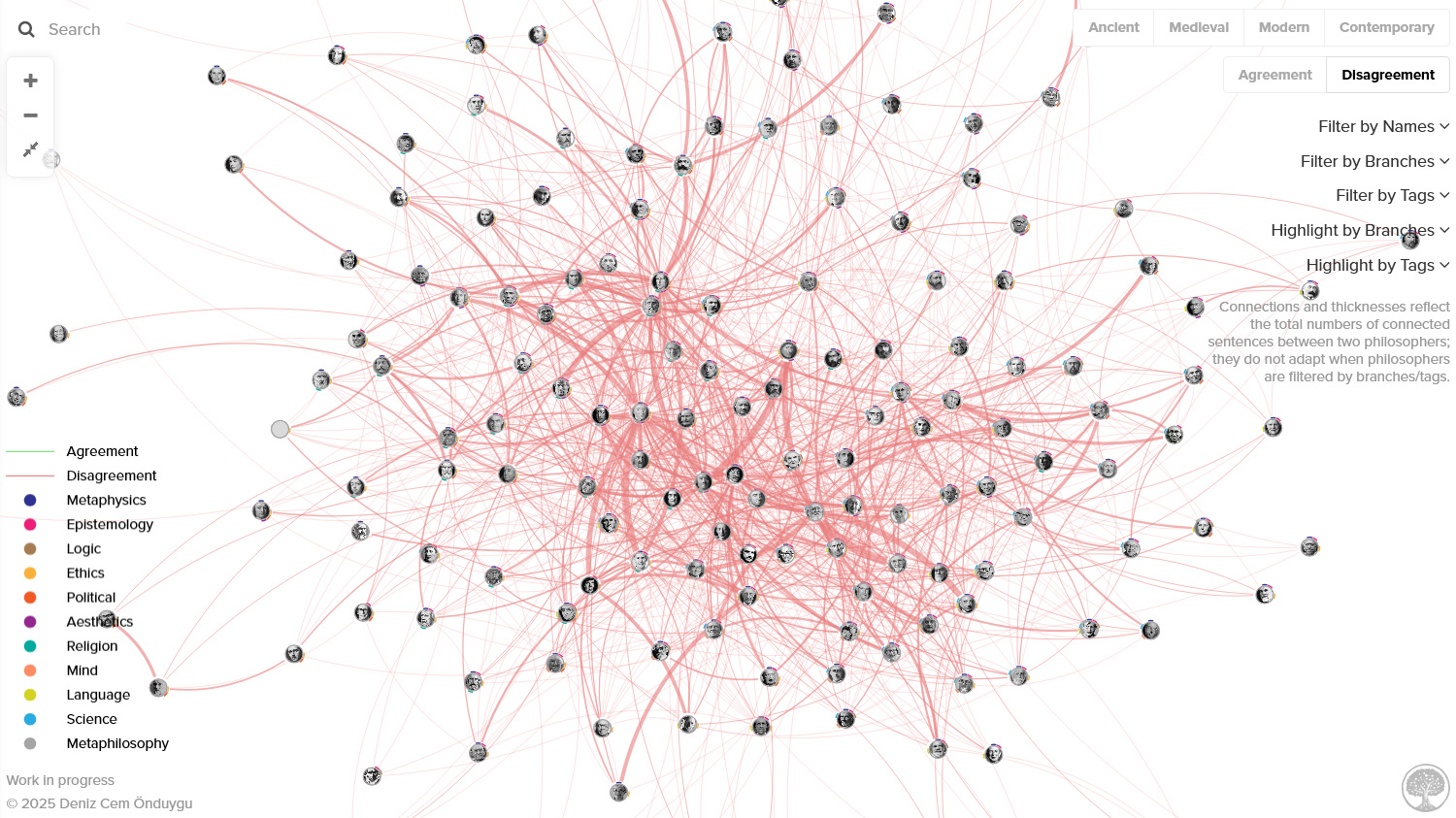
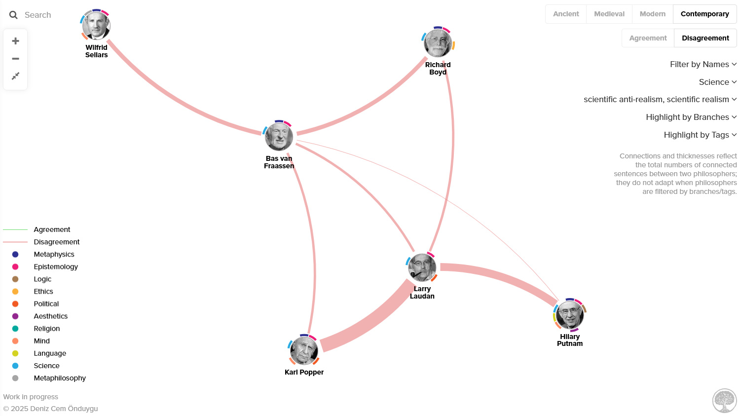
The thicknesses of the connection lines reflect the total numbers of connected sentences between two philosophers, so you can read them as a general representation of the dis/agreement levels between two people. (Please note that they do not change/adapt according to branch/tag filters – e.g. when you use the “aesthetics” filter, the connection thicknesses still reflect the total numbers including other branches.) As in the main project, the connections are not always based on direct/acknowledged influence and not directional, for reasons I elaborate on here.
I specifically did not want to give disagreement connections negative strengths (which would push nodes away from each other) because disagreement relationships between philosophers usually mean they are working on the same themes or problems (by developing counter-arguments, etc.), and thus have constructive effects – maybe even more so than the agreement relationships. So I decided it makes sense to see strongly disagreeing people close to each other as well, in the context of philosophy.
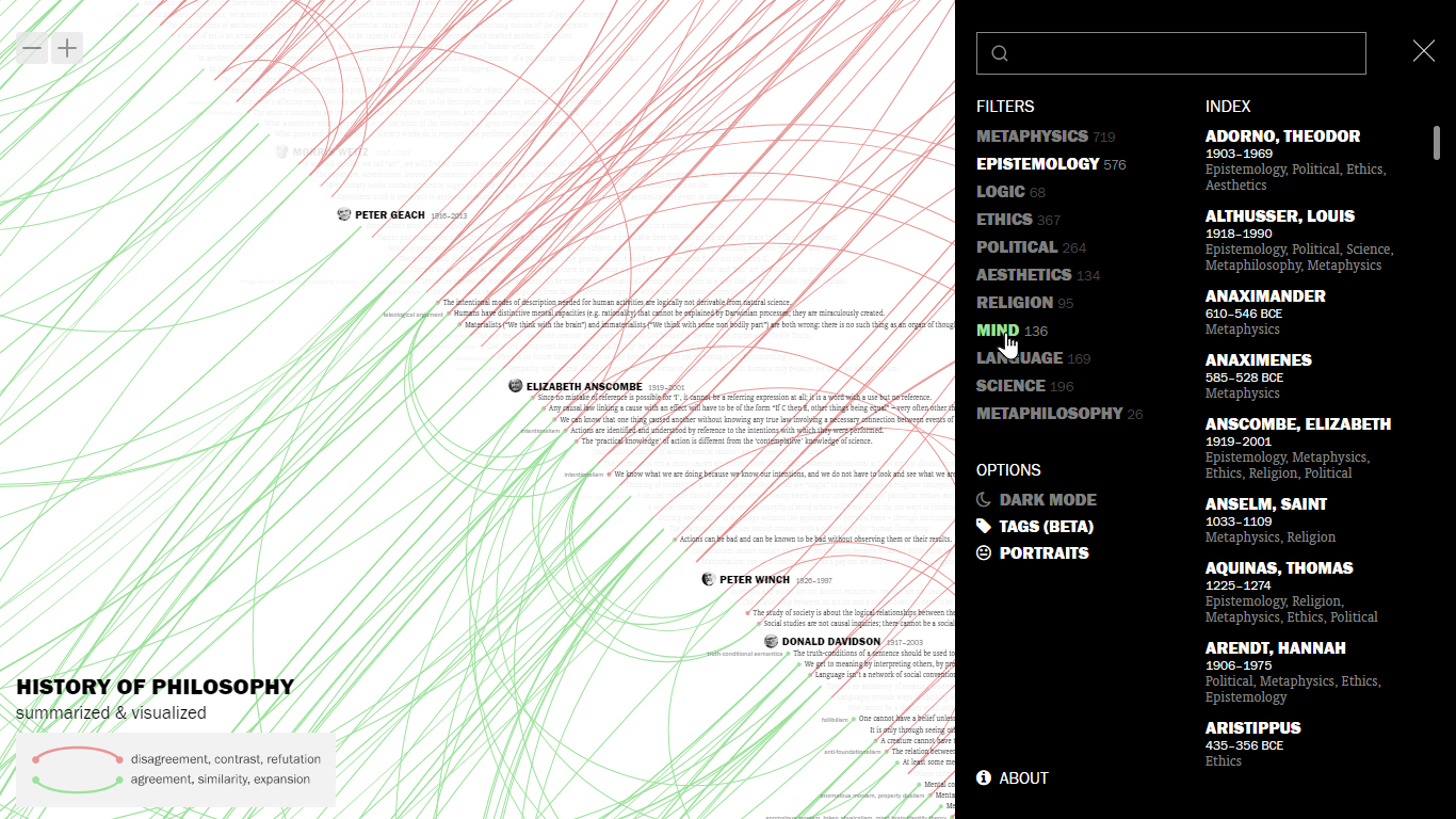
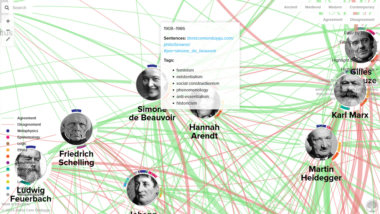
The colored little “flags” around philosophers represent the branches of their sentences, with a legend at the bottom left.
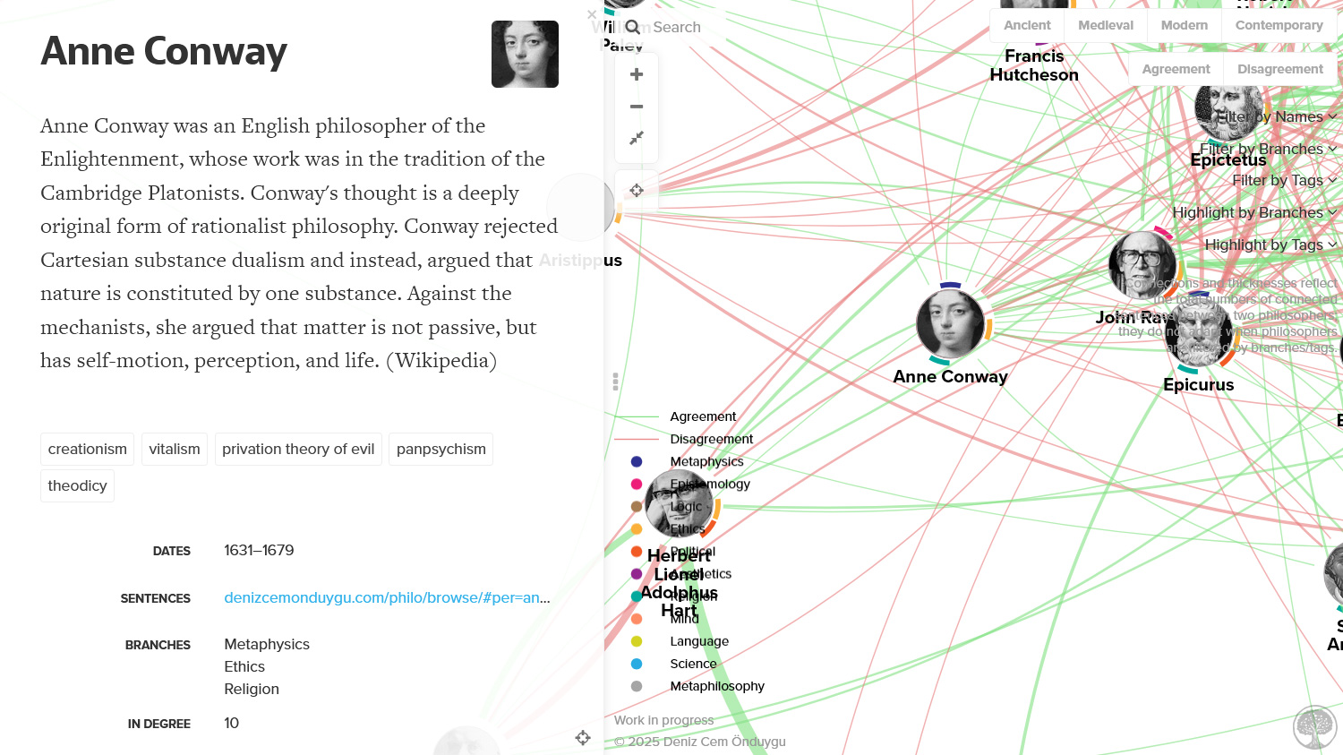
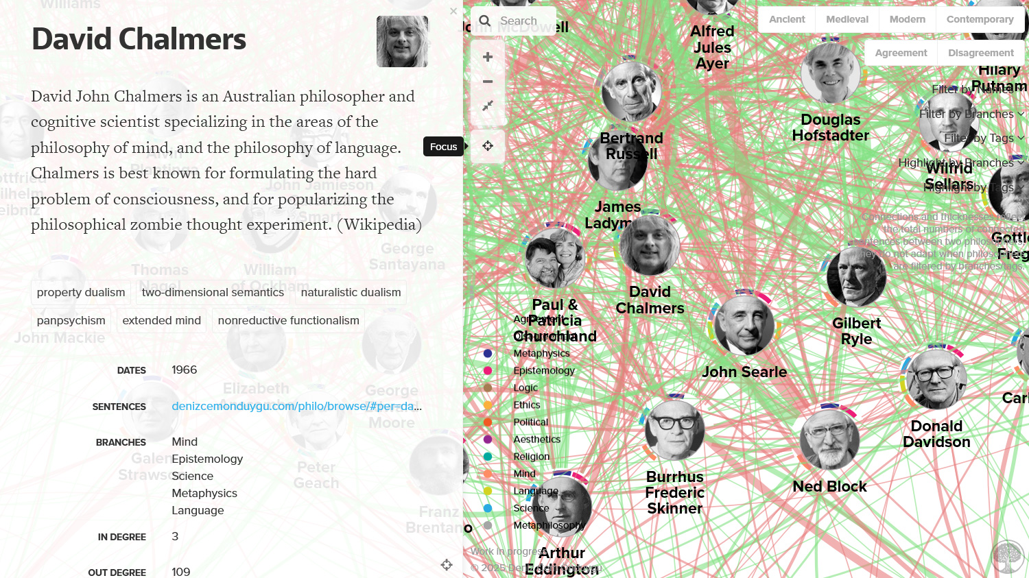
I also included short descriptions for each philosopher, shown in the profile panel that appears when you click on philosophers. (I used a small program I created in a few minutes with the help of AI to automatically extract these from Wikipedia, and then went over them with a lot of quick edits. They probably will get better with time.)
Filters and Highlights
One of the strongest features of this visualization is the filters and highlights I created. Like my sentence-based system, think of it not as a visualization but a dynamic system capable of generating thousands of visualizations with different contents, contexts, and functions.
You can filter philosophers by their periods; ancient, medieval, modern, contemporary. (The borders between periods can be vague and I had to make some decisions there.)
You can filter connections by their type; agreement or disagreement.
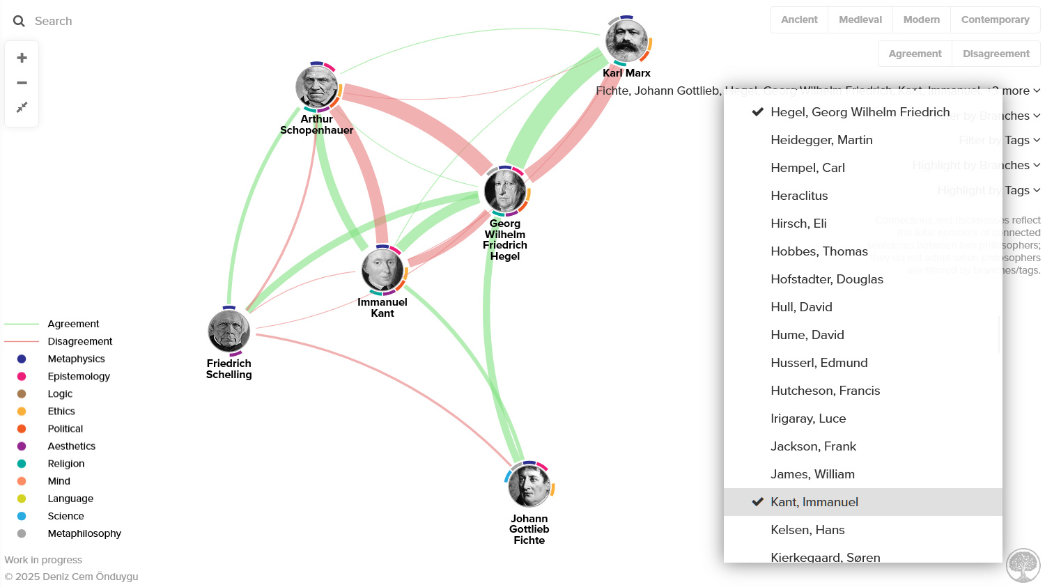
You can filter (multiple) philosophers using a dropdown list of names.
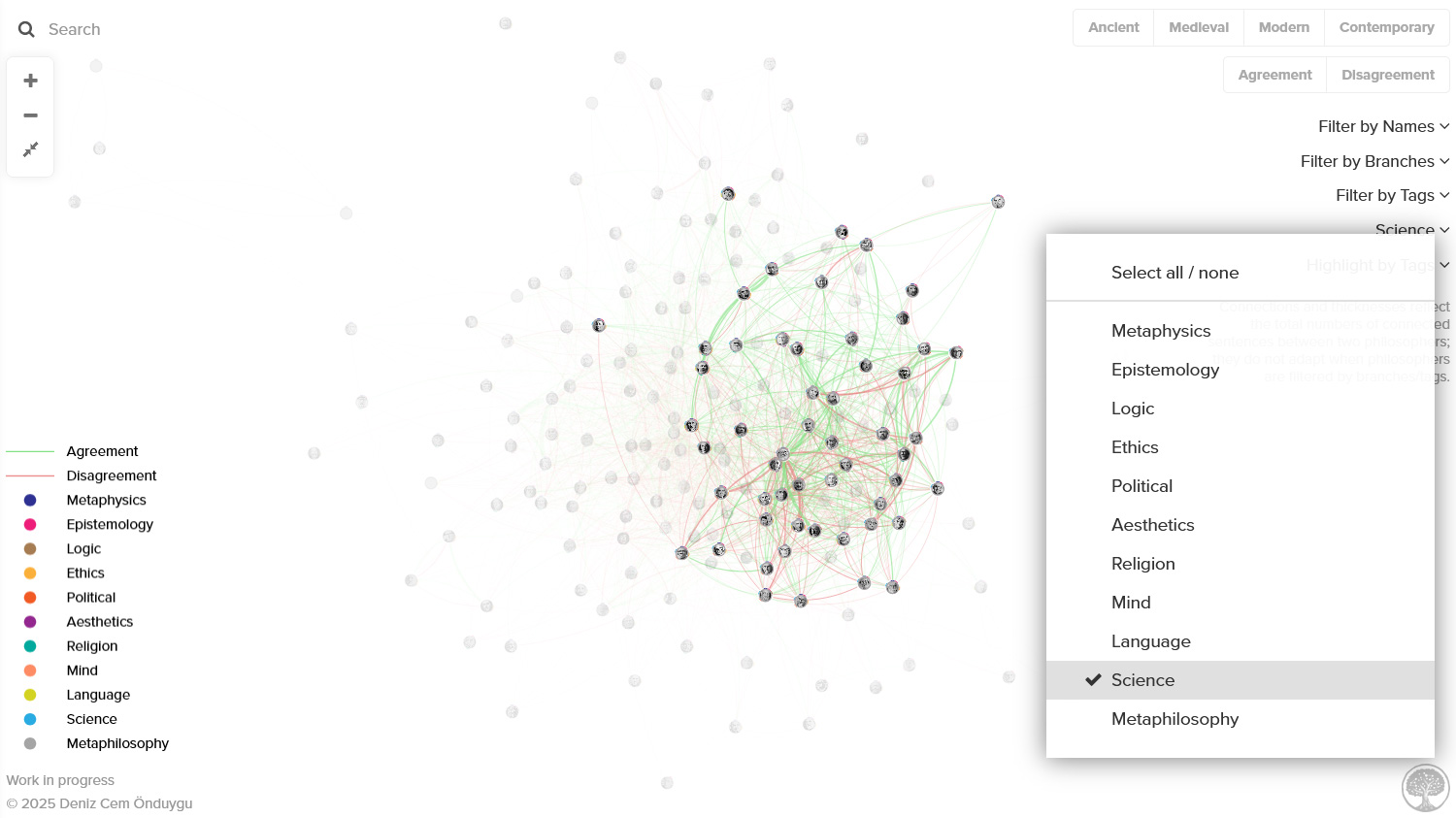
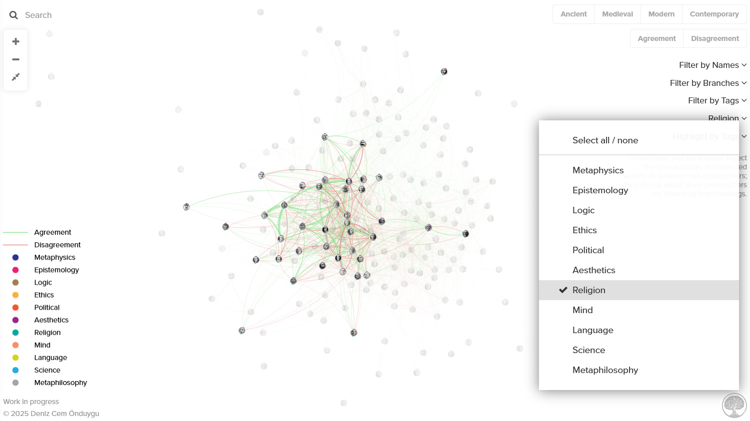
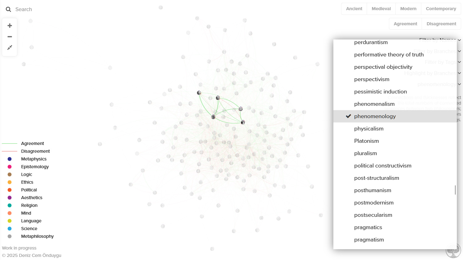
You can filter philosophers using a dropdown list of branches.
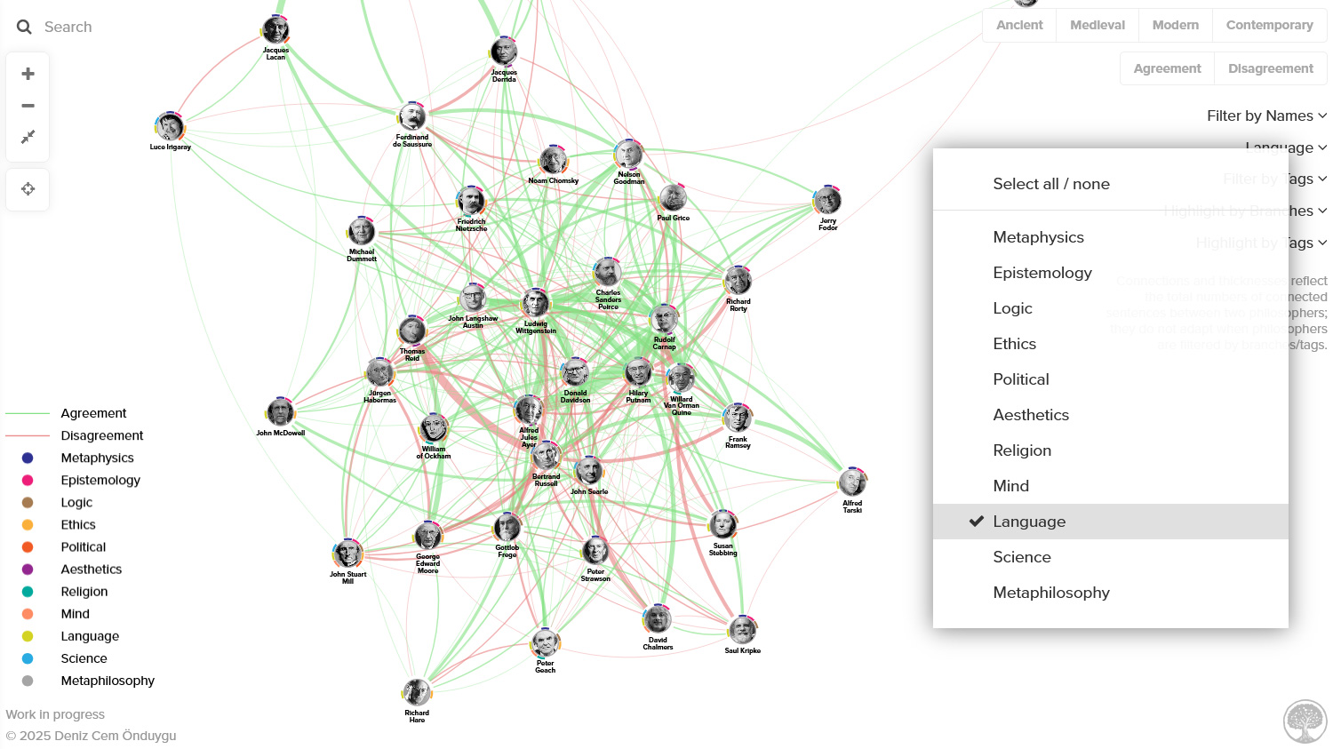
You can filter philosophers using a dropdown list of tags.
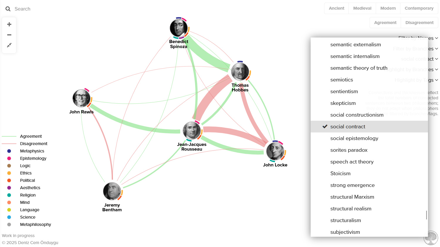
Many tags reveal only one philosopher since they are too specific or I have not yet included other people with the same tag. But I chose to keep those tags in the menu for situations where you might want to filter by multiple tags to see networks around a theme: e.g. post-structuralism + postmodernism + social constructivism + structuralism + ….
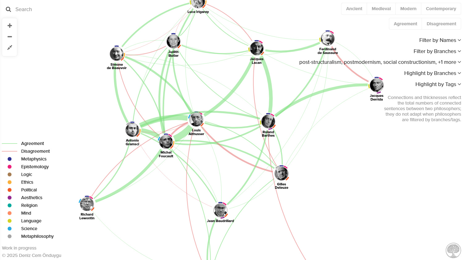
You can highlight philosophers using a dropdown list of branches, seeing the rest of the network in the background. This can help you make sense of the regions of the network.
You can highlight philosophers using a dropdown list of tags, seeing the rest of the network in the background. Again, this can help you make sense of the regions of the network.

And you can use these filters in combinations, e.g. to show the “disagreement” connections between “contemporary” philosophers of “science” who write about “scientific anti-realism” and/or “scientific realism”.
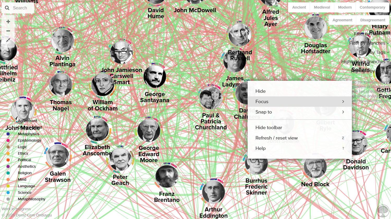
You can also focus on one philosopher and their connections either by right-clicking and selecting Focus or using the Focus icon that appears beside the profile panel when you left-click on them.
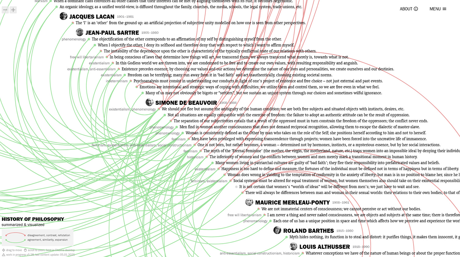
I know there have been many projects exploring the influence networks of philosophers using different platforms and databases. The ones that I remember were all based on data that is programmatically scraped from the web (Wikipedia, SEP, etc.). What I like about mine is that it is based on an intensely curated, richer database – not in terms of the number of philosophers, but in terms of the layers of information: separate and weighted connections for agreements and disagreements, and branches and tags, all coming from my 10-year research for the original sentence-based visualization. I am also satisfied with its usability, with a simple and effective information design and user interface.
Still, I think that this philosopher-based method is not as informative as my sentence-based one: it’s great fun to play with when you are familiar with at least some of the philosophers, but the information is “lower definition” compared with the one with the sentences, and it could be less interesting to the uninitiated and to people who dislike philosopher-based engagement with philosophy. To make it a bit more functional in this regard, I added customized links for the detailed sentence-based views of the main visualization in the boxes that show up when you hover/click on philosophers. In my future work, the main platform will continue to be the sentence-based one, and this will be a secondary visualization which will be updated alongside – two different ways to explore the same research.
A final general note: The limitations of the main project (which you can read about on the About page) also apply here. Since the editorial work is continuously done by me, it’s a never-ending work-in-progress; not everybody is here, and the connections/branches/tags of the included philosophers aren’t exhaustive. If your favorite philosophers aren’t there, they probably are in my to-add list with 100+ people. You can see and subscribe to the updates here.
I need another 10 years. In the meantime, I hope you enjoy playing with it as much as I do. Jump in.