History of Philosophy: Tags, Improved Search, Dark Mode, and More
I’m happy to announce another batch of interface upgrades in my History of Philosophy after a year, this time accompanied by the introduction of a new content type as well, which amounts to another substantial improvement for the information architecture and the user experience of this project.
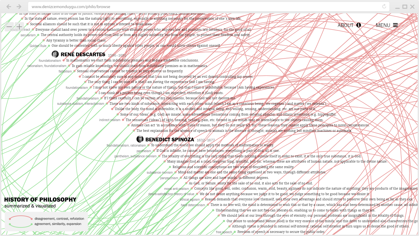
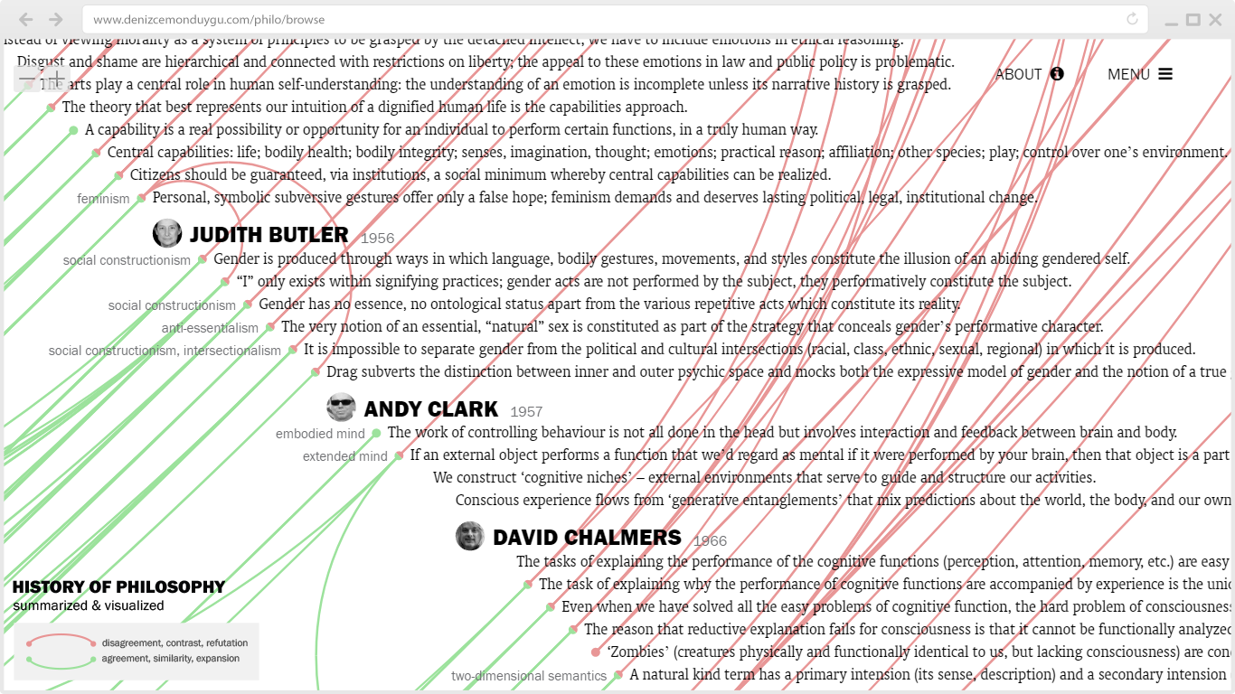
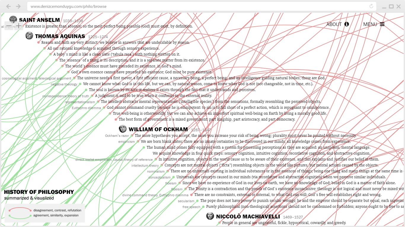
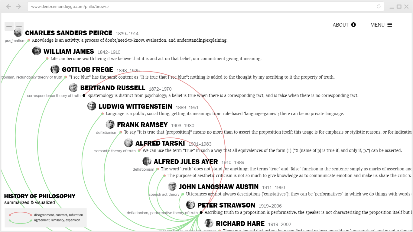
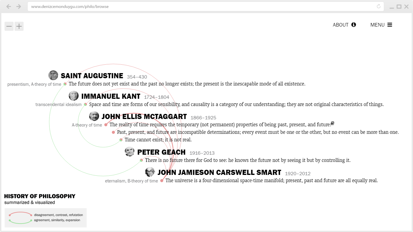
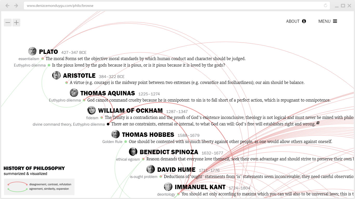
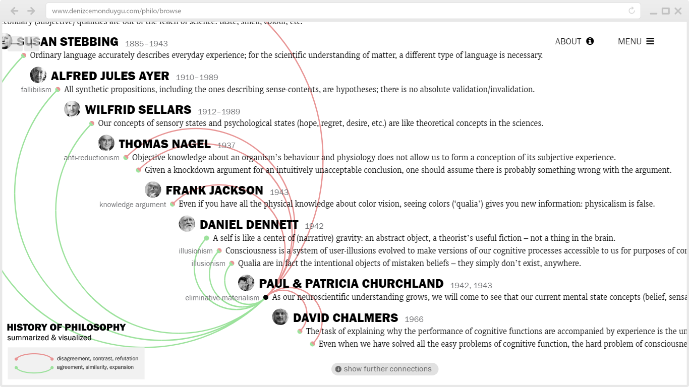
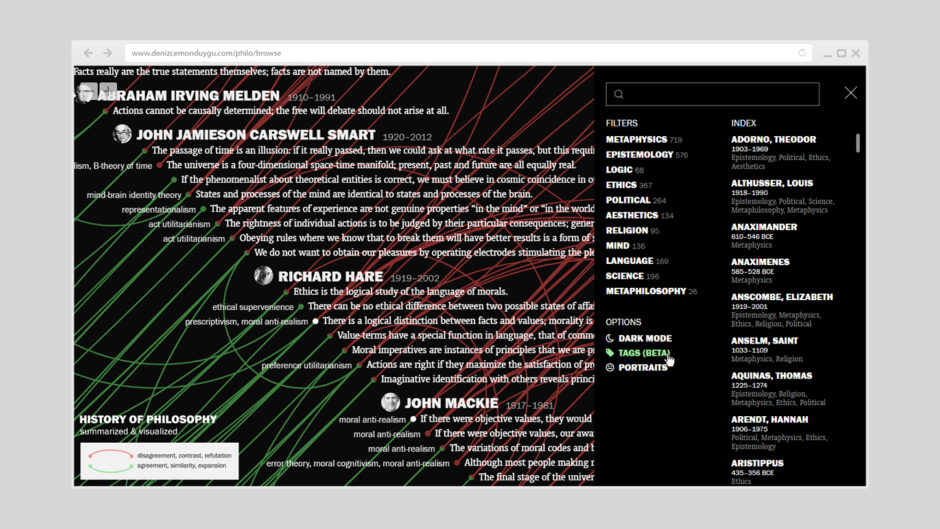
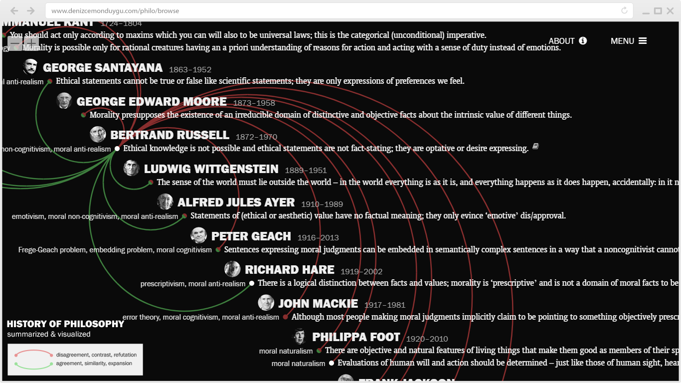
I’ll start with the most important and exciting bit: sentence tags. This is the new type of content I mentioned above – something I’ve been planning and working on for a long time. Tags are shown on the left of the sentences and they include names of specific arguments (e.g. cosmological argument, knowledge argument); theories (e.g. correspondence theory of truth, A-theory of time); many kinds of -isms for approaches, schools, doctrines, etc. (e.g. empiricism, existentialism); or other informative keywords for certain issues, themes, concepts, etc. (e.g. problem of evil, social contract) that don’t appear in the sentence itself.
Tags are useful in many ways. If you happen to be familiar with the terms in the tags, they give you a snapshot of the philosopher’s work before reading their full sentences, or help you quickly find a specific sentence that you’re looking for – or vice versa, if you read the sentences, you get an idea of what those (sometimes obscure or vague) terms stand for. The dis/agreement links for the sentences usually work for the tags as well: you can tell which theories/schools/etc. are in dis/agreement with each other by looking at how they’re linked. (Of course, there are exceptions to this where tags refer to different parts of the sentences which contain several ideas.)
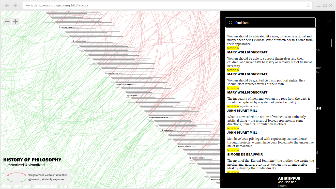
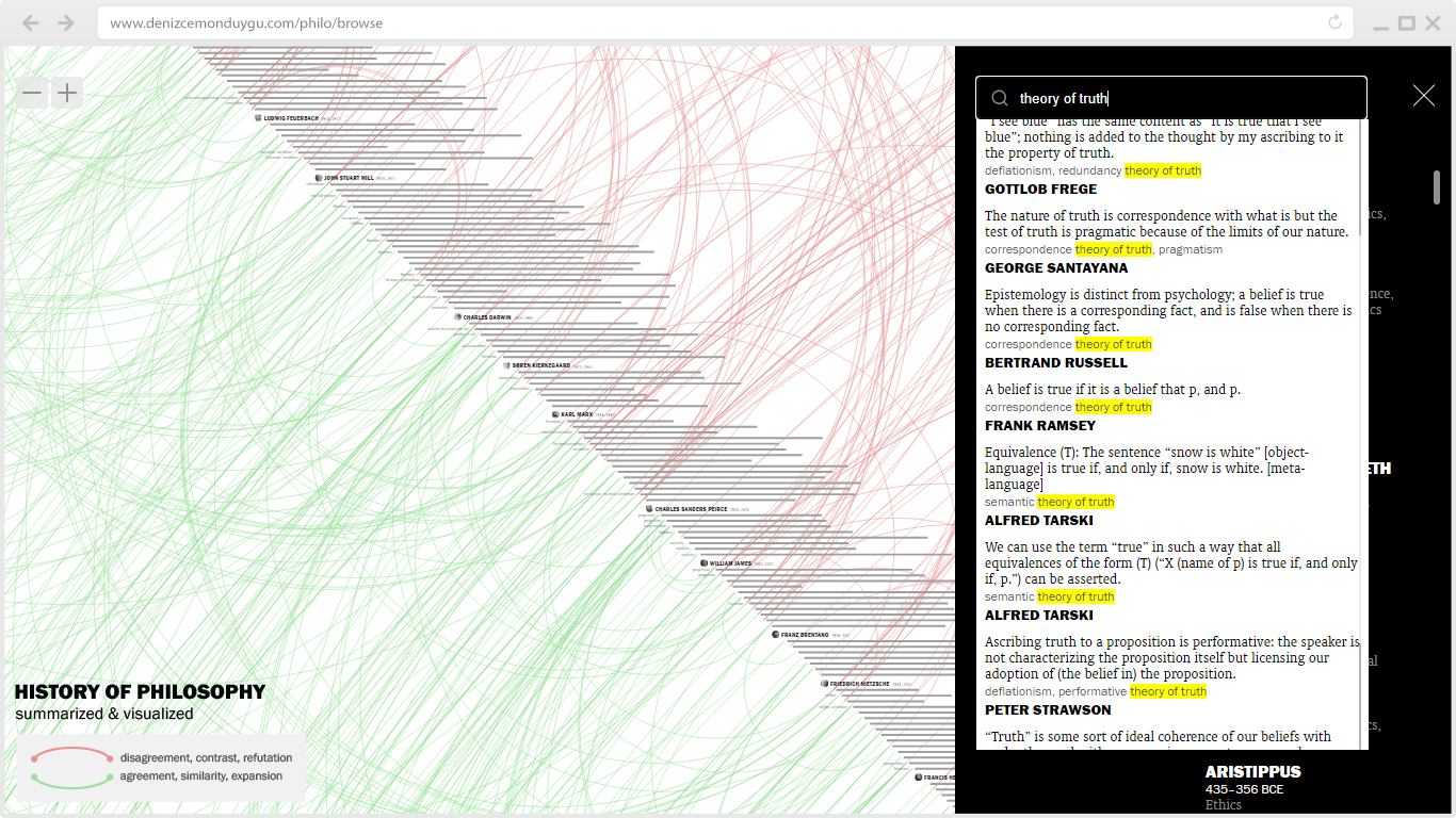
Tags are also a great addition to the search function: you can just search for “feminism” to see the related sentences, or “theory of truth” to list sentences belonging to different truth theories such as correspondence theory of truth, coherence theory of truth, identity theory of truth, etc. And you can click on a sentence in these search results to jump to it in the visualization. Overall, tags open up a new layer of wayfinding and learning in this jungle of ideas.
Not every sentence has tags (1) because tagging is an ongoing manual process that I’ve been carrying out for some time and (2) because not every sentence is suitable for tags. After I started tagging, I realized I had to develop some rules of thumb. For instance, in cases where the majority of a philosopher’s sentences can be tagged with the same -ism term, I acted stingy by tagging just a few sentences that best represent the -ism in question. Similarly, I avoided using [Name]ism tags for sentences of the person with that name (e.g. Marxism-Marx), with a few exceptions.
I know they look inviting but tags themselves in the visualization are not clickable; I haven’t created a tag-based filtering function, yet – I may do it in the future. You can hide tags, if you like, using the option in the Menu. My initial plan was to make their default visibility off, but now I think they’re too useful to keep hidden in the Menu.
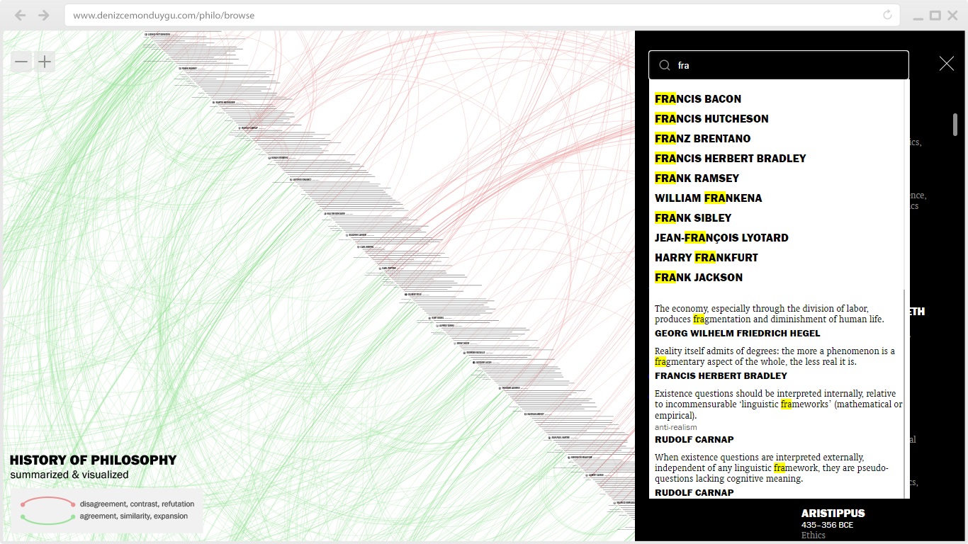
I also included philosopher names to the search function so that we can quickly search for and jump to the specific person we’re interested at any moment without dragging the visualization or scrolling the alphabetical Index in the menu. (While clicking a name in the Index drags the whole visualization to that person’s position without any filtering, clicking a name in the search results behaves like the name-clicking on the visualization: it goes to a fresh screen with that person and their connections only.)
The addition of tags and names to the search function is also a great improvement for the mobile experience since it’s harder to pan along the whole timeline to look for people/ideas on a small screen. (Although tags are not displayed in the visualization on mobile, they are still searchable.)
Dark Mode and Other UI Improvements
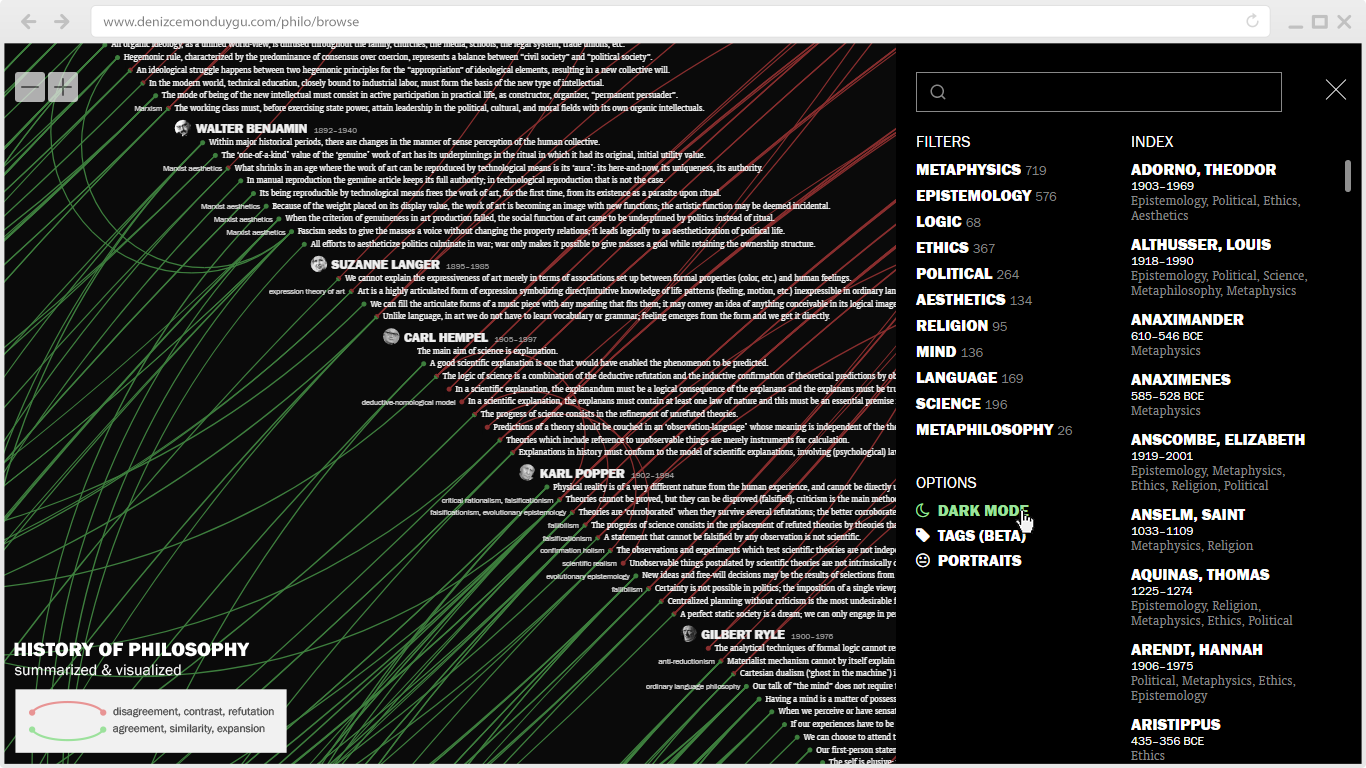
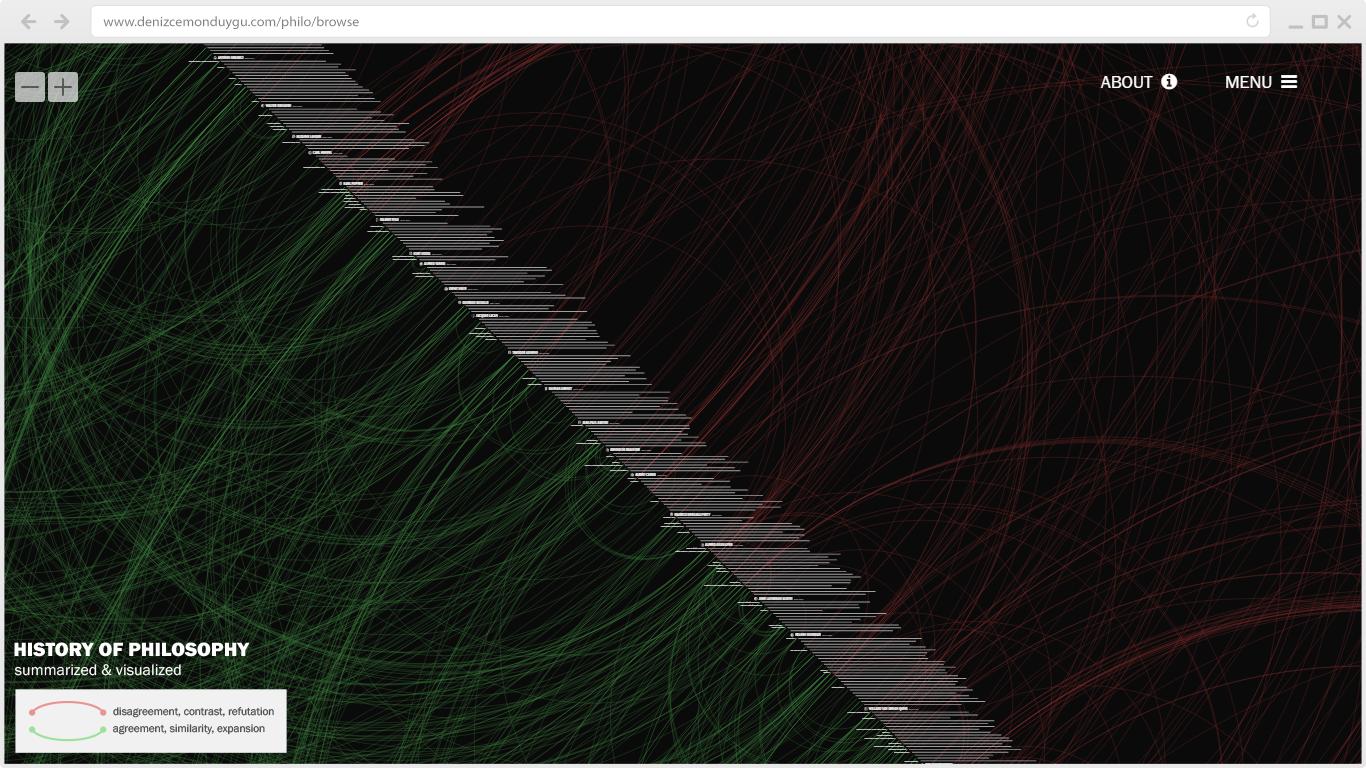
I’ve had many requests for a Dark Mode option from people using the interface for long periods of time. I finally coded it; the option is in the Menu (desktop only). As I had promised in the last UI update post, I also added a button in the Menu to hide the portraits, for people who might want it – I myself have decided to keep them on by default because of their cognitive benefit in navigation.
Another promise fulfilled: I added the reference (book) icon in the mobile interface, just next to the dot on the left of the sentence.
I slightly shifted the whole visualization to the left, to keep more sentences within the screen boundaries.
I added hover behaviors to every clickable thing (sentences, person names, the reference icon, and the SFC button) in the sentence/person screens.
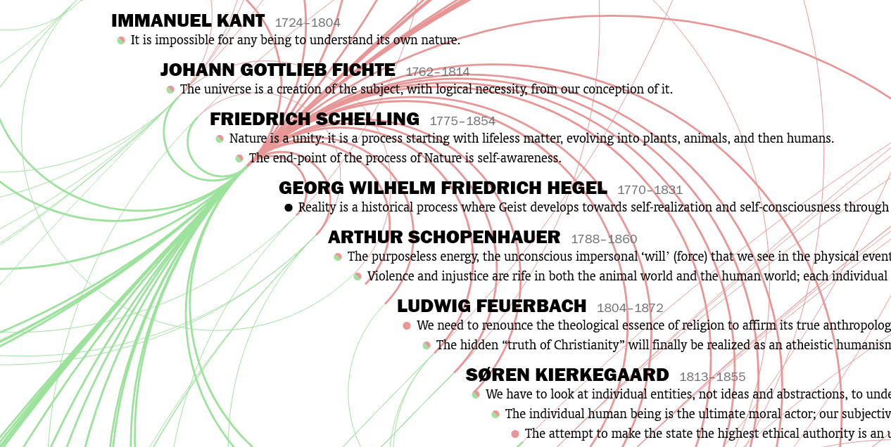
And last but not least, I fixed some nasty link-drawing bugs. Regular users will remember: after some clicks on sentences/names, especially in cases where there were lots of sentences, the positions of the newly drawn/scaled links used to shift and miss the dots they were supposed to connect, sometimes to an amount that made it impossible to read the connections. This bug was very annoying to me because it was messing with the whole point of the visualization. I figured it was a performance problem, and solved it by adding a timeout of a few hundred milliseconds between the many tasks the program was trying to do after the click. This caused some animations to behave less smoothly but now the links never shift – and seeing a correctly drawn, readable visualization is what’s important to me here.
Hope you enjoy. I have some more tagging to do…

