- Date February 7, 2019
- Category Design, My Work
- Tags data visualization, Devildriver, Dry Kill Logic, Gojira, Johann Sebastian Bach, Lamb of God, last fm, metal, Metallica, music, Slipknot, Spotify, subjectivity
- Comments 0
- Time 13 Minute Read
My 2008–2018 in Music
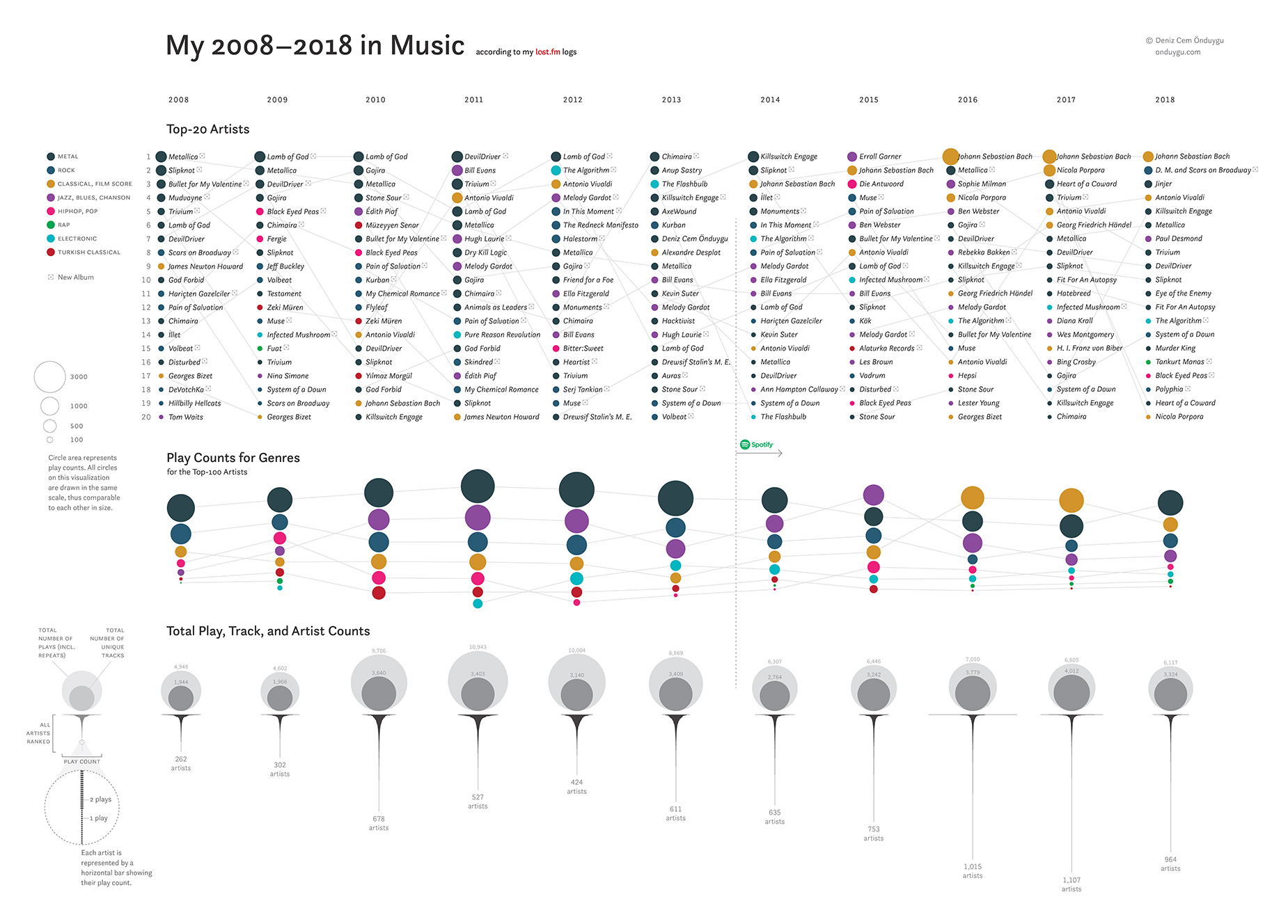
When the 10 Year Challenge hit social media last month, I challenged myself to do a datafied version. One of the few personal data sources I have that goes back 10 years is my Last.fm logs. Last.fm is a service that allows you to track (“scrobble”) what you listen to on whatever platform you’re using, thanks to a plugin called Scrobbler. I have been a regular Last.fm user since 2006, which means I have logs for my 12 years of listening. So here’s my 2008–2018 in music. (It’s actually not 10 but 11 years because “2008–2018” sounds better.)
The genre categorization is of course pretty rough: I wanted to keep it small and crammed many other genres into these eight, to keep the color-coding functional. I chose the colors for metal and rock ambiguously close to each other in purpose, as a reflection of the ambiguity I felt when I was classifying many artists who can be said to be doing either one, or both.
I usually don’t write about my process but this post will be an exception because the things I want to say about this little side-project can be best told by going through my journey of constructing it, step by step.
At first, I only wanted to do the bubbles for the top-20 artists as a fun little exercise and publish it on social media as my contribution to the 10 Year Challenge – no biggie. But when I did that, I noticed that not every year had the same general pattern for the top-20: some years (the 2010–2013 period) had a more homogenous distribution with rather large bubbles overall, and the more recent years had a quick differentiation in size between the first artists and the following ones.

Then I checked the total play counts and total artist counts for each year and understood that there was a structural change in my listening habits. I needed to have a more global look at the distribution of the ranked play counts for all artists. My computer scientist friend Amaç scraped the 7156 rows of data for me. I created bar charts as rank-frequency plots and rotated and centered them to give a clearer picture of the distributions within my narrow columns.

These plots revealed exactly what I wanted to see: like signatures from different people, each year had a unique structure for how many artists I listened to, in what way. Some years were bulky at the top with shorter tails, meaning that I repeatedly listened to a smaller group of artists. Other years had smaller tops with very long tails, meaning I listened to a large number of different artists, with less repeats. And this structure dominates after 2014. What happened there?
Spotify happened. I checked my emails to find out that I had signed up for Spotify in September 2013 – before that, I was using my own mp3 archives with iTunes. For a year or so, I used iTunes and Spotify in alternation, using the former to listen to my old things and the latter to discover new stuff; then I exported all my playlists and completely moved in Spotify. What Spotify does is to make discovering – or just passing by – artists very easy, with playlists automatically generated for your taste, playlists for specific moods, an option to “autoplay similar songs when your music ends”, etc. Thus it makes the rank-frequency plots’ tails longer (more artists) with less time/motivation to repeat things you already love (less bulky tops). By the way, my period of obsession with Bach (those wide horizontal lines at the tops of recent years) isn’t caused by Spotify, though the latter may have had some facilitating effect by offering dozens of Bach albums by various performers.
The gray bubbles showing the total count of unique tracks and the total count of scrobbles (including repeats – light gray) tell the same story: Even though I have less scrobbles after 2014 (which probably has other reasons than Spotify), I listen to large numbers of unique tracks, the repeat-ratio being much smaller.

Yes, the Spotify explanation might seem obvious here but there may be other causes for my changing habits, such as my life events, the fact that I’m getting older, etc. To be more confident about it from a statistical point of view, we should be looking for the same pattern in hundreds of other people’s listening stats. Luckily, I have some backup: “Since 2014, the average number of artists each listener streams per week has increased 37 percent.”
In addition to all kinds of changes in my music habits, another theme of working with this visualization for me was the role personal experience and knowledge play in data gathering and grooming. It became apparent in two different problems – and their solutions.
For my color-coding with eight categories to work, hundreds of artists had to be classified into these eight classes. Now Last.fm has “tags” for artists but each artist has many tags. Scraping those and making them fit into my categories would have required quite a bit of programming. What’s more, there were artists in my logs who produced music in different genres but whom I had been listening to for their output in one specific genre. So I chose to manually tag my artists with my eight categories. (I set the threshold at the top-100 artists for the Play Counts for Genres section.) It was my experience of them that mattered here.

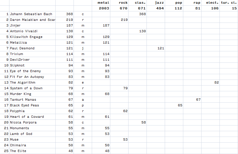
I did the genre tagging by going through the list of artists for each year, quickly putting one-letter abbreviations (m: metal, etc.) in a column, and let the rest of the spreadsheet do the genre play count calculations according to that.
Another place where my experience mattered was the ‘new album’ icons. If I had placed those icons via a program parsing the data found on the internet, there would have been many many more of them because the program would put every new release (full-albums, singles, contributions, re-releases, etc.) in there. But when I put them in there, going through the dates and album covers with my own strained eyes, I chose the ones that I knew I listened to that year (be it a full-album or a single), and left out the ones I didn’t (because I didn’t know about it, because it was a single / contribution / re-release I didn’t care about, etc.). So the ‘new album’ icons do their job in this visualization because I placed them myself, instead of getting them from an automated program.
Don’t get me wrong: I’m not a programmer but I love programs and algorithms (I use and trust them in many projects, mostly thanks to my programmer friends) and I’m not one of those people who insist there is no such thing as objective data – quite the contrary. To this day I did lots of data projects dealing with my personal life, and a lot more dealing with systems other than myself, but I daresay this little project is a first for me in occupying an interesting intersection of the two. Unlike Vital Signs which already fully consists of data about myself, and unlike Metallica on Stage in which I went along with the objective playing/listening data without questioning, here I was manually filtering external data about other things (artists, albums) from a subjective perspective. Methodologically, it was new to me – and however laborious the process was, it was fun.
And maybe, the most intriguing aspect of the intersection of personal and external data in this project lies in the other direction: I believe that the artist-play distributions changing in a specific way because of Spotify, revealed in my own plots, is a general pattern for the majority of music listeners in our day. So if I’m right, my visualization of my own experience allows us to witness a global and objective change in the world. How cool is that.
- Date February 7, 2019
- Category Design, My Work
- Tags data visualization, Devildriver, Dry Kill Logic, Gojira, Johann Sebastian Bach, Lamb of God, last fm, metal, Metallica, music, Slipknot, Spotify, subjectivity
- Comments 0
- Time 13 Minute Read


