The Trouble With Text
People don’t like texts. Forget reading, they don’t want to look at them. Or so think amateur designers. That’s one explanation I have for the examples I give below.

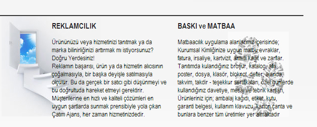
Detail from the web page of a print shop

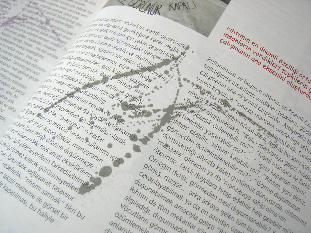
Detail from a magazine on sustainable architecture. (No, I didn’t spill coffee on it, it is designed like this, on multiple pages.)
Maybe there are some explanations for these specific cases in the minds of their designers; maybe these just didn’t turn out as they expected. But these are just two examples of a wide-ranging phenomenon. There definitely is a tendency, among amateur designers, to “design” bodies of text by putting images behind them.
I don’t expect amateurs to know how to set text according to The Elements of Typographic Style, but I expect them to let the text be at least visible for God’s sake. (Note that the problem here isn’t one of absence of knowledge/talent/technique/element, it is one of addition. It is something unnecessary that they add that makes it unreadable – if they don’t do anything, it would be better.) I expect any sane person who knows how to read to look at this shit and recognize that there’s a fundamental problem, that it betrays the very reason for existence of text – to be read. This is plain disrespectful for the writer of the text, the text itself, and for the readers.
Edward Tufte’s words for chartjunk (a term he coined for the use of ornament and decoration in information design) would apply just as well to some of these cases of text-massacre:
Lurking behind chartjunk is contempt both for the information and for the audience. Chartjunk promoters imagine that numbers and details are boring, dull, and tedious, requiring ornament to enliven. Cosmetic decoration, which frequently distorts the data, will never salvage an underlying lack of content. If the numbers are boring, then you’ve got the wrong numbers. Credibility vanishes in clouds of chartjunk; who would trust a chart that looks like a video game?
Worse is contempt for our audience, designing as if readers were obtuse and uncaring. In fact, consumers of graphics are often more intelligent about the information at hand than those who fabricate the data decoration. And, no matter what, the operating moral premise of information design should be that our readers are alert and caring; they may be busy, eager to get on with it, but they are not stupid. (…) Disrespect for the audience will leak through, damaging communication. (Envisioning Information, p. 34)
I believe the problem may also be rooted in the fact that people who are not regular readers are given the job of designing text; if text is just one boring black squiggly image to you, why not collage it with other more interesting images? I’m not claiming that every graphic designer has to be an avid reader (though it sure helps). In fact, you don’t have to be a regular user of the product that you’re designing; a male product designer who doesn’t shave his legs can design an epilator, but only after having made sufficient research about the users and the usage of it, and maybe having used it on himself for a while. So, if you are not a reader but want to (or have to) design text, you should at least try to read it yourself for a change. Ironically, Robert Bringhurst starts his Tactics section in The Elements with a subsection titled “Read the text before designing it”:
The typographer’s one essential task is to interpret and communicate the text. Its tone, its tempo, its logical structure, its physical size, all determine the possibilities of its typographic form. The typographer is to the text as the theatrical director to the script, or the musician to the score.
Let me rephrase it for people who don’t have the time: “Skim the text after designing it”. It doesn’t take a lot of time, and it would prevent most of these disasters.


Leave a Comment
Join the conversation.