Metallica on Stage
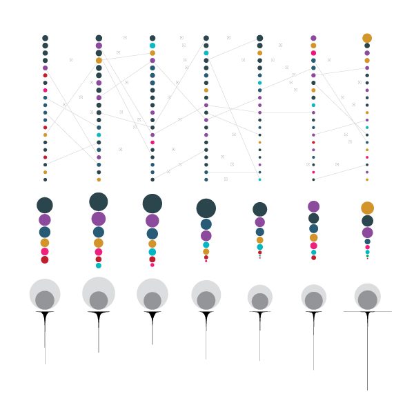
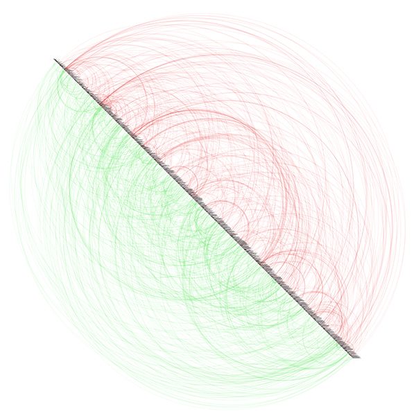
This is an examination of Metallica’s concert history from 1982 to 2012 (not included) with a focus on the numbers of songs played live and the albums that they belong to. I and my friends at Çilek Ağacı took the raw data from Setlist.fm (plus Last.fm in the last part), groomed it and visualized it with our own tools.
The colors of the albums – a key feature of the whole visualization – are chosen according to the album cover artworks; Metallica fans can easily understand which color corresponds to which album without reading their names. As a convenient surprise, new albums (Load, Reload and St. Anger) that are stylistically different from the old ones are all tints of orange-yellow and this provides a natural visual grouping in the charts. (Try to see this grouping when you look at the charts.) Death Magnetic, which is their newest album but musically much closer to the old ones, has its brownish gray shade (again, taken from the real album cover), and that separates it visually from the Load – St. Anger period. Read more about it here.
Winner of the Bronze Medal in Data Journalism and of the Community Award in the inaugural Information is Beautiful Awards (2012).

Listed in the 20 Great Infographics of 2012 on Visual.ly.

Listed in the 20 Great Infographics of 2012 on Visual.ly.


